A. Print Advertisements
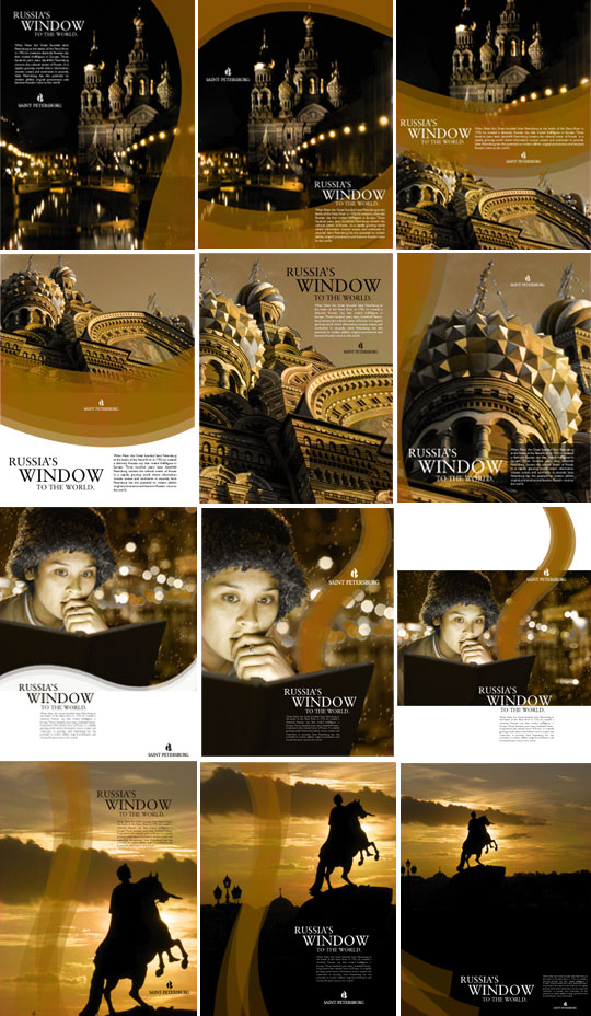
Grayscale and full color print advertisements for the city appear in magazines, newspapers and other publications across the world. These examples show several possible interpretations of the brand ideals by using the correct elements as specified in this guide. In this case, the Neva curves and Angel Gold mix with a large Sabon headline, but even these limited selections can lead to thousands of creative layout ideas.
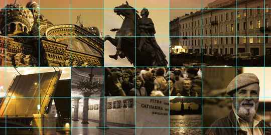
Typically, the 2006 promotional materials use Angel Gold as the primary color, including a sepia tone for the photography. Although designers may use other dominant colors or photography tones, there must be a special reason for doing so. For example, if a tourist ad is focusing on boats on the Neva River, the use of Neva River Blue makes sense. When designing multiple pieces for the same campaign, make sure than several elements remain consistent to help connect the messages, such as using the same fonts, colors, curves, photos or textures.
B. Promotional Brochures
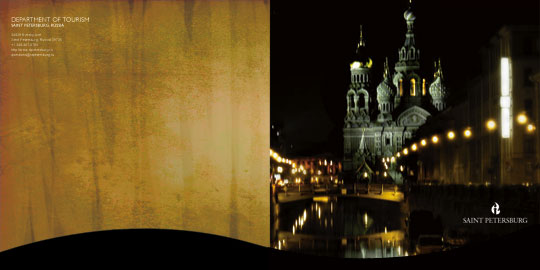
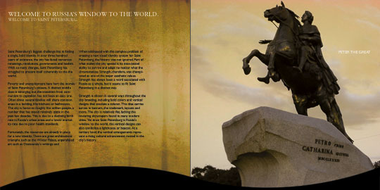
Full-color brochures may be used for tourism promotions worldwide, metro information, exhibition schedules and more. These are some examples of using the correct elements, as outlined in this guide, to create an effective piece. The same basic thinking behind the above ads are apparent here. The inside spreads make use of Gill Sans for the body copy, as well as keeping the flowing Neva River curves running across many of the pages to create a smooth, continuous feel.
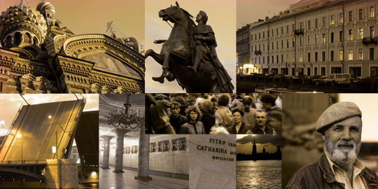
In any brochure, a diversity of subjects in the photographs should be readily apparent. A mix of monuments and nature, people and vehicles, night and day, and depth of field should be implemented. This gives the brochure and the city a well-rounded look. Again, the designs below are just examples and should not be literally copied.
C. Letterhead
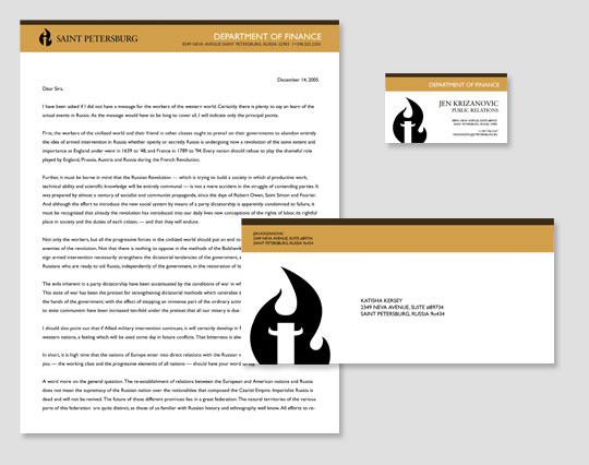
The city letterhead is clean, simple, and flexible. Different colors may be substituted for the gold bar at the top to help distinguish between departments or branches; this may be decided on a case-by-case basis. The general layout, however, will always remain consistent. Keeping the colors and department name at the top of the letterhead allows for quick identification when sorting through a stack of papers. Business cards may have the flame embossed or add a gloss for more impact.
D. Environmental
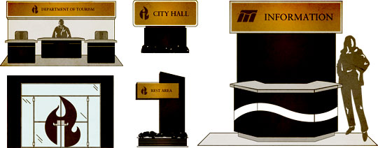
Environmental graphics such as wayfinding signs, kiosks and banners should incorporate a signifying graphical mark (with the city logo as a default) and the main information set in Sabon. Permanent signs will be cast in bronze, while temporary signs will use a faux finish that serves as a close match. By keeping these colors consistent, visitors will immediately identify signage throughout the city. In case of multiple languages, stack the titles vertically, not horizontally, unless constrained by the physical space.