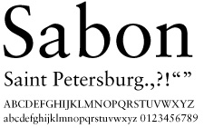
A.Sabon
 Sabon is a strong, dignified font that captures Saint Petersburg's powerful history. This is the default typeface for headlines and should usually be applied with all capital letters. Sabon is used for the logotype as well. The strict serifs and bold strokes give it a distinguished feel that works well with the Saint Petersburg's elements of strength. The vertical strokes are thick, emulating the column found in the city trademark. In the majority of applications, the normal weight of the font will be sufficient. In instances of questionable hierarchy with multiple lines in a document, bolds and italics may be used to differentiate between lines. Emphasis: history and strength.
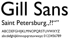
B. Gill Sans
 Gill Sans is a rich sans-serif that reflects the city as the cultural center of Russia. The lighter, wider letters compliment the bolder letters in Sabon. Smooth curves and no contrast in stroke weight make Gill Sans an excellent choice for presenting a sense of unified art. Gill Sans is used primarily for body copy. The light and bold typefaces in particular add variety to this typeface's uses. The light can be used for page headers, numbers, and stylized headlines. The bold can be used for subheads and emphasis within body copy such as special announcements. Emphasis: culture and art.
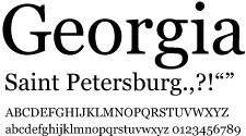
C. Default Screen Font
 Georgia should be used as a default font when Sabon and Gill Sans are not available (for example, office computers without the correct display fonts, web use and simple word processing programs). It still carries a distinguished feel, but should only be used if no other options are open.