A. Vehicles
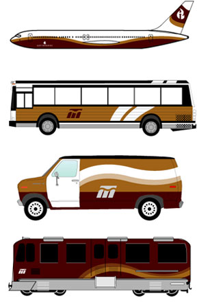
Saint Petersburg's public transportation ranks among the best in the world. With efficient paths, clean stations, and innovative technological advances, thousands of residents and visitors alike use public transportation daily. The dominant color for public transportation is red, usually with gold and white as accents. Using the Neva Curves creates a sense of dynamic motion that compliments the vehicles nicely. Clicking on the animation below shows how the curves seem to flow as the train picks up speed. Since these vehicles will be present above, on, and below the city streets, consistency in design is important. All vehicles should be clean of advertisements or any additional graphics, and the Metro logo should be visible from every side and angle on the ground transportation. City-branded planes carry the rostral column mark instead, the beacon flame rising above the tail, making a strong brand statement as the plane enters different countries. Due to the damage Saint Petersburg's cold climate can have on these exterior graphics, most vehicles should be re-painted once every 2-3 years to make sure they don't fade too badly over time.
B. Uniforms
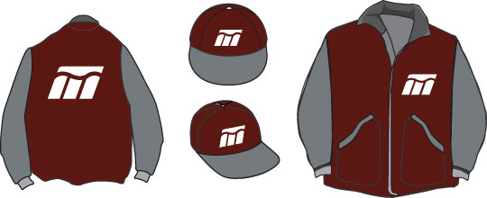
City uniforms must first be comfortable for employees to wear daily. Therefore, many of the uniforms are conditioned especially for the cold weather. Jackets, long-sleeve cotton shirts, sweatshirts and accompanying hats will help keep the city employees warm while working outside. The jackets should allow for maximum flexibility and movement.
These are examples of the standard issue uniform for the metro system. Front and side pockets should be put in all jackets as a place to keep hands warm in when they are not needed. Thicker, warmer hats without logo may be substituted for the standard city offerings, but their color should compliment or stay neutral against the main jacket colors.
C. Metro
 The Saint Petersburg metro system is world renowned for its beautiful, elegant stations that seem to belong in a mansion instead of underground. Crystal chandeliers hang from the ceilings, artwork graces the walls, and tiled floors lead passengers through 60 stops across four different lines. No wonder it is the most popular form of public transportation in the city.
The metro logo is divided into four sections, symbolizing the four main sections of Saint Petersburg that the system extensively covers. The central curve represents the Neva River, which the metro system goes underneath. The logo is basically a stylized miniature map of the city while retaining the look and feel of the main city identity.
 The crimson color from the city palette is used in all metro-related materials. Since riding a metro can be a frustrating experience in some cities, the Saint Petersburg metro must always strive to be an elegant and above-average way to travel.
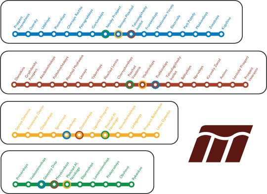
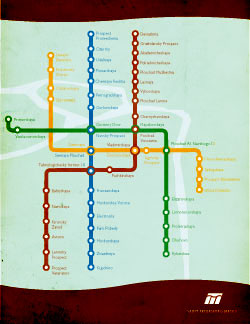
The standard metro map is a clearer, modified version of previous maps. By slightly distorting the directions of the lines instead of drawing the map perfectly to scale, the map is easier to read and more simple in figuring out how to reach any given destination. The map is accented by two illustrated curves and a light rendition of the Neva River underneath.
This map will appear on displays in every station, as well as brochures and posters. Do not adjust the text size of the stops when resizing the map, since many stations have long names and will either be too small to see or run into the colored lines. As seen in the previous page, each stop will have its name on several large signs, so people of any language will be able to recognize where they need to get off even if they canÌt understand the conductorÌs voice.
 Inside the subway, each car will have a horizontal map of their carÌs colored line above eye level (usually around or above the door). This ensures that even in heavy crowds, passengers can look up and clearly see how many stops are left until their destination or when to transfer to another line. The station names are slightly tilted, which allows them to fit and remain legible in the limited space. The maps read from left to right, northbound to southbound. They should be accompanied by the full standard map somewhere in the car as well to allow passengers multiple ways to plan their stops accordingly. When attached to light fixtures, these maps illuminate in the undergroundÌs low-light conditions.
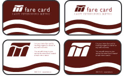
The Saint Petersburg stations were among the first in the world to utilize smartcard technology. In this system, a tiny chip is placed inside each card that allows it to be easily read by waving it over a scanning bar. The cards actually save money because they diminish the need for tokens, paper cards or magnetic strips. Many passengers will buy one card that lasts them several months or even an entire year.
The cards display a pair of illustrated Neva curves on the front, with a single curve taking up the negative space between them on the back. Simple instructions direct users who might be unfamiliar with this new technology how to scan their card and refill it with more money. Cards are distributed at kiosks that are located at stations and various city businesses above ground, and are available in a variety of languages.
